
A Kleur Guide to Transforming Small Spaces: Big Impact, Small Effort
A Kleur Guide to Transforming Small Spaces: Big Impact, Small Effort
It’s not the size that matters, but how you use it… Size isn’t everything, as they say – especially when it comes to design. All jokes aside, small spaces can pack a serious punch with the right colours, finishes, and a few clever tricks, here’s how to make every square centimetre count!
Light & Bright for the Win
First things first, light is your best friend. Lighter colours create an airy, open feel, making walls seem like they’re stretching further than they actually are. We love colours such as, So Close, Lily White and Bolders Beach.
Listen, we love a moody accent wall as much as the next person, but in a small space, lighter colours are your best friend. When using soft neutrals, think Sandy Beach where you have an array of gentle undertones and no deep hues to keep the space calm and collected.
Keen on a touch of colour, our kinda people, Think light and airy but with a twist. Soft pastel colours such as Blush, Salty Dog and Chardonnay. And of course, don’t forget neutral tones, such as our old faithful, Old Boy.
These colours have the power to reflect natural light, making it feel open and bounces the light around the room like a well-aimed rugby pass. Game mindset meditation: “Today I am open. Today I am expansive.” rather than “Today I am a tiny cosy cupboard.”
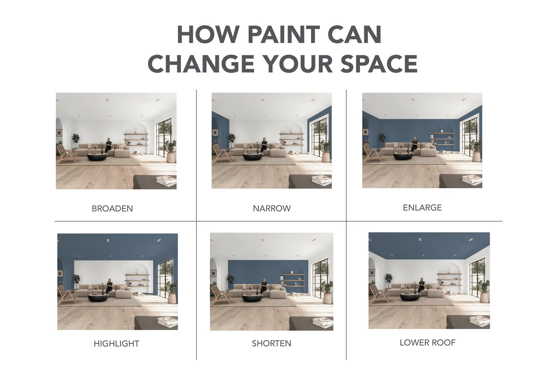
But, if you’re not a neutral girly (or guy) you don’t have to play it safe with only light colours. A rich, moody colour on a feature wall or even the ceiling can add depth and drama, tricking the eye into thinking the space is more expansive than it is. Darker colours work particularly well in small bedrooms or nooks, we love Sea Urchin, Seaweed and Nevermind for a look where a cocooning effect is more of a win than a woe.
Go Vertical!
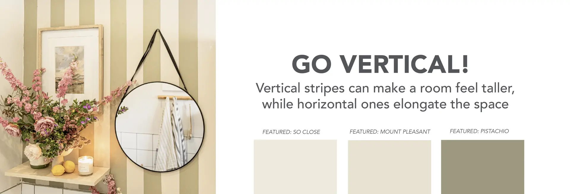
Now, let’s talk about stripes, yes, we’re bringing them back! Vertical stripes can make a room feel taller, while horizontal ones elongate the space – If you’re a women your mom probs taught you this already…
This simple trick gives the illusion of more room without knocking down any walls (although, we won’t stop you if you feel like a bit of DIY demolition). Another great visual trick is painting the ceiling a shade lighter than your walls, it draws the eye upward, making the space feel loftier. Colour combos we’re loving for a space like this is: Great White on the ceiling and skirting and Weskus or Gently Worn on the walls, with stripes in either a soft green, Volan or Pistachio or blue such as Wild Coast or Grey Heron.
The 60-30-10 rule
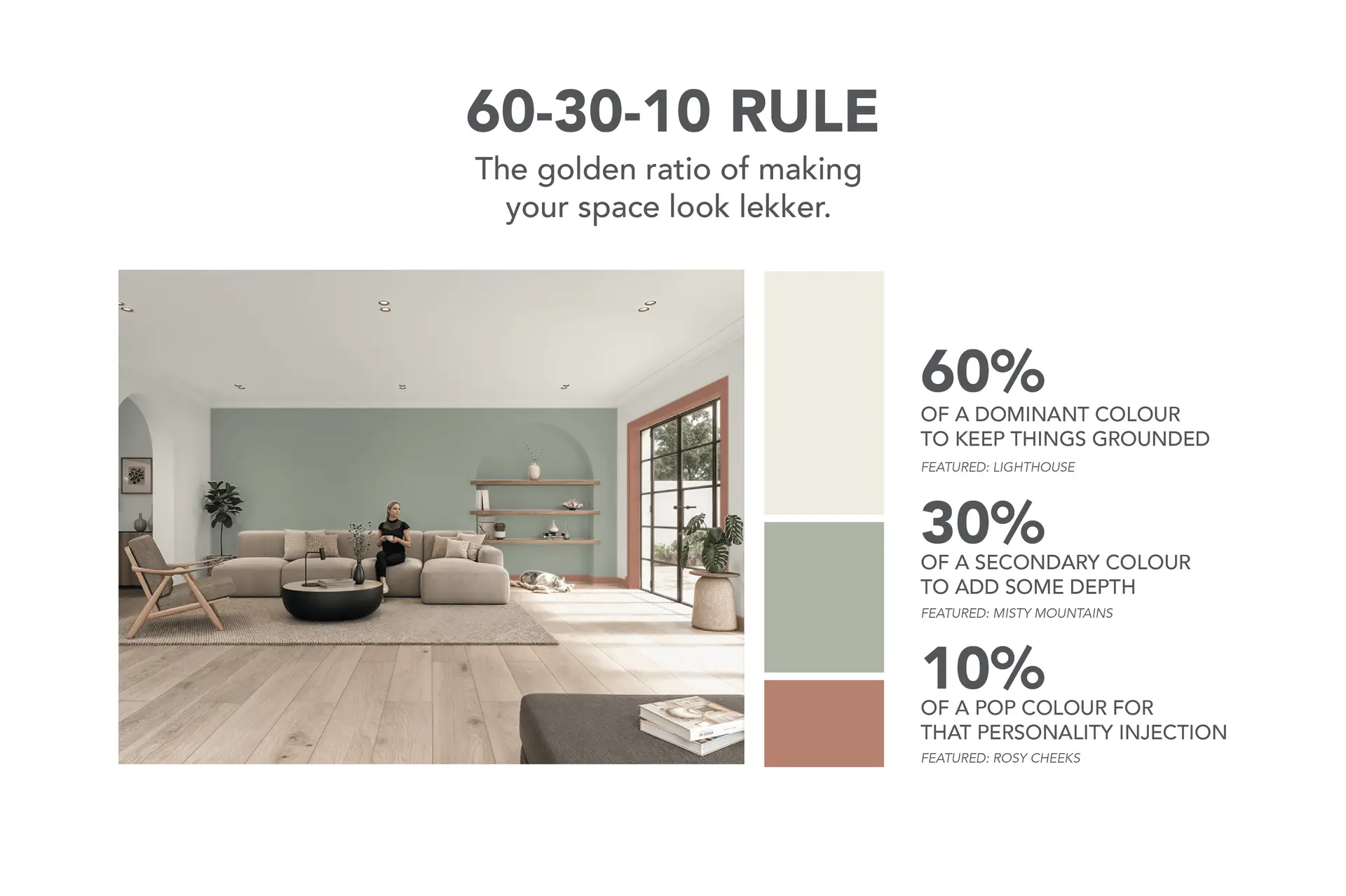
Small spaces need balance, otherwise, things start looking like a toddler was let loose with a paintbrush. Enter the 60-30-10 rule: the golden ratio of making your space look lekker instead of rookie gone wrong.
Use 60% of a dominant colour to keep things grounded (walls, bigger furniture pieces, basically, the serious stuff), 30% of a secondary colour to add some depth (rugs, curtains, or a cheeky accent wall), and 10% of a pop colour for that personality injection (we’re talking vibey cushions, quirky décor, doing your skirting or cornice in a colour, or even a bold vase your ouma would side-eye). Stick to this, and your space will look curated, not like a lucky packet of random colours.
A Whole Home Approach:
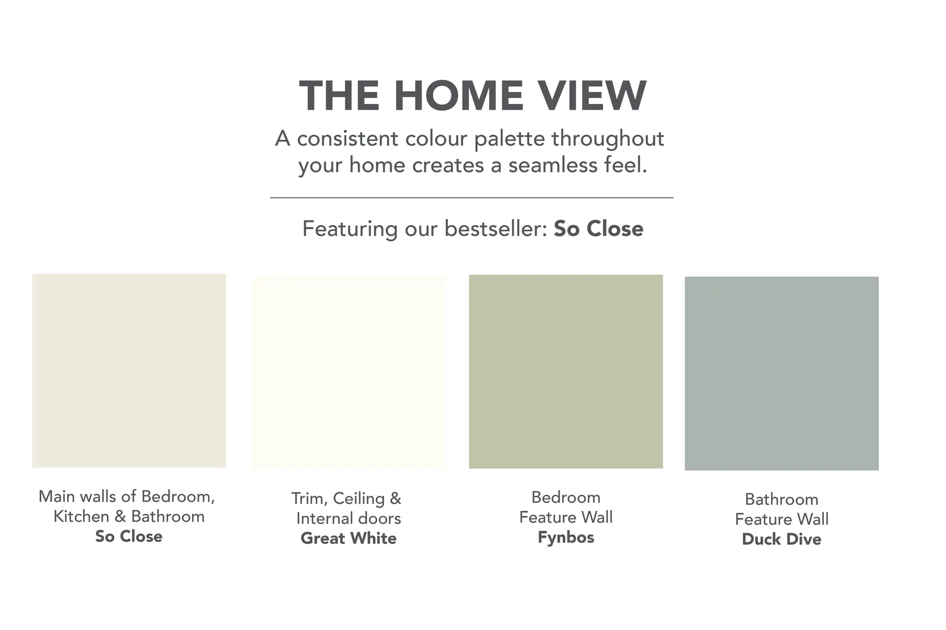
Now, now – let’s not forget about flow, life is an ebb and flow after all. Keeping a consistent colour palette throughout your home, big or small, creates a seamless, expansive feel. If each room is wildly different, small spaces can feel even more disjointed. Using similar colours across adjoining areas makes everything feel more cohesive and intentional.
And while we’re talking about cohesion, remember that furniture and decor play a big role, too. Lighter-coloured furniture blends into the space, making the room feel more airy, while well placed mirrors and glass surfaces reflect light, furthering the illusion of openness.
The Power of Finishes:
Lastly, don’t forget about the power of finishes. Our Luxury Matt paints absorb light and creates a soft, sophisticated look – often looking a little flatter, so in a dark colour it would make the space feel more expansive. But watch out, Matt isn’t a friend to mess. While glossier finishes reflect light, adding a tiny extra level of brightness. Choosing the right finish for the right space can make all the difference. For high-traffic areas, Poly is your winner, because it’s washable finishes that allow for easy clean-ups without sacrificing style.
Because let’s be honest, a small space means everything is a little closer together, so walls are bound to get their fair share of fingerprints and scuffs.
DIY Room by Room Recommendations
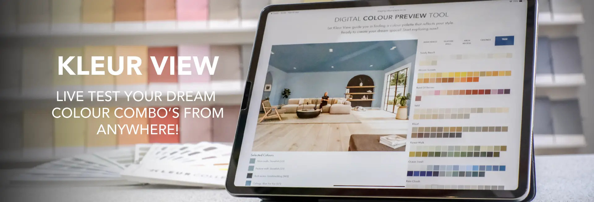
As we always say, your space, your rules. So, make sure it feels good to you! Play around, have fun, and don’t be shy to experiment with colour. That’s where our banger of a colour visualiser, Kleur View, comes in. This game-changer lets you see colours and combos in live action, from anywhere in the world! No more guessing games or surprise outcomes.
Once you’ve found the one (your colour, not your soulmate, soz, we can’t help with that), pop into one of our stores and steal a Colour Card. Give it a proper look-see, and while you’re at it, grab a tester pot to see how it plays on your walls in different lighting. It’s like the learner’s test → driving lesson → driver’s licence of paint-picking. BOOM. No regrets, just glorious, well-thought-out colour choices.
With these tricks up your sleeve (and a tin of Kleur paint in hand), your small space is about to get a major glow-up. Ready to get started?
If you’re in more handy tips & tricks, we have a banger Pinterest Page – where we have an aptly called Tips & Tricks board where we spill all the good tea for you.
Your first project just got better! Join the Kleur family and enjoy 10% off your first purchase.