
Walk into any paint shop with the idea that you’re “just going to grab an off white – pft a flat white, maybe – and you’ll soon find yourself spiralling into a rabbit hole of undertones and philosophical debates about whether “Quite White” and “So Close” are, in fact, different colours. Choosing the right white can feel like picking the perfect avo – you’re either too early or too late.
But fear not, dear DIYer. We’re here to break it down and help you choose your perfect white without the existential crisis. Because at Kleur Space, we get it. White is one of the most powerful and versatile colours under the sun, but it’s also one of the trickiest. So before you reach for just any white, let’s break it down. We’ll help you understand undertones, room orientation, lighting, reflection and of course, which shades from our Sandy Beach collection can make your space sing.

Not All Whites Are Created Equal
Let’s get one thing straight: there’s no such thing as “just white.” White paints have personalities. They can be warm (with undertones of yellow, red, or even peach) or cool (leaning towards blue, grey or green). This subtle difference can transform your space, so choosing the right white should be more than just giving up and choosing a colour based on your favourite name in the whites collection (this sentence is based off a true story….).
The real magic of white lies in how it lets other things sing. Timber floors, leafy greens cabinets, colourful cushions, and earthy ceramic – white sets the stage! It layers beautifully with textures and tones, especially if you’re going for a calm, mindful space.
Try layering a wall in Gently Worn with warm wood shelving and natural baskets. Or use Sea Salt with rattan light fittings and soft blue accents to create a clean, coastal feeling.
White also pairs wonderfully with bold accent colours. Want a blue wall, such as Slow Down? Pair it with Great White as trim to create a crisp finish. Love terracotta décor? Let Weskus frame the moment without stealing the show.
Once you’ve landed on the right white, you might start craving a little neutral shade contrast to bring your space to life. If you’re after a calming, understated feel that still adds interest, look no further than the Veld range. These moderate mid-tones are perfect for creating a soothing contrast without stealing the spotlight. But if you’re the type who loves a bit of drama (and we don’t mean in the WhatsApp group), go bold with something moody from the Kloof colours. These deep and ultra-deep tones bring a richness and intensity that pairs beautifully with our Sandy Beach’s off whites.
So, the low down: Sandy Beach gives you your trusty light tones, Veld offers those grounded, mid-toned neutrals, and Kloof delivers depth and drama. Mix and match depending on the room’s mood, light, and how brave you’re feeling on paint day. The world’s your oyster!

Understand the Light in Your Space
Light is everything when it comes to white paint. The same white can look fresh and clean in one room and dull or even cold in another. Here’s how to think about it:
North-Facing Rooms:
In the Southern Hemisphere, north-facing rooms get loads of direct sunlight throughout the day. These rooms can handle cool and warm whites beautifully. So really anything goes in a space here. But the major plus in spaces like this is they already feel warm and bright so adding a blue- or grey-based white can look amazing.
Try These Colours:
Sea Salt: a cool, elegant white with soft green undertones that add sophistication without starkness.
Whitewater: crisp and clean but not too cold, perfect for enhancing the natural brightness in these spaces.
South-Facing Rooms:
South-facing rooms don’t get the same kind of warm light and can sometimes feel a bit cold and dim. To counteract this, you’ll want to choose warm whites that introduce warmth (and a bit of life) into the space.
Try These Colours:
So Close: a soft, creamy white with warm undertones that bring cosiness into colder-feeling rooms.
Quiet White: gentle and inviting, it adds warmth without going too yellow.
Gently Worn: a lived-in, relaxed kind of white, perfect for spaces that need a little extra charm.
East-Facing Rooms:
These rooms get morning light, which is cooler and softer. To maximise that, a warmer white works well to keep the space from feeling too chilly in the afternoons.
Try These Colours:
Lily White: this delicate ever so warm white is ideal for bedrooms or bathrooms where you want a soft, serene feel.
Boulders Beach: a neutral go-anywhere white that works especially well in rooms that get changing light.
West-Facing Rooms:
The afternoon sun can be harsh and golden, so cool or neutral whites help balance the orange tones and stop the space from feeling like a roast chicken in a convection oven.
Try These Colours:
Great White: striking but balanced, this works well in high-contrast west-facing spaces.
Weskus: laid-back and breezy, it tempers those intense afternoon rays like a gentle sea breeze.
Think About Your Room’s Purpose
White isn’t just a background colour, it sets the tone. Are you trying to create a bright and energetic kitchen, a calm and dreamy bedroom, or a timeless and chic lounge?
Bedrooms: Choose softer, warmer whites like Weskus or Gently Worn to create a sense of calm.
Kitchens and Bathrooms: Crisp whites like Whitewater or Sea Salt add a clean, modern look.
Living Rooms: Flexible whites like Boulders Beach or Quiet White work beautifully with both warm and cool décor.
Hallways and Entryways: Try Lighthouse to brighten transitional spaces and reflect as much light as possible.
Our Top Combo Picks:
Need some inspiration on what colour palette to go for in your home? Look no further!
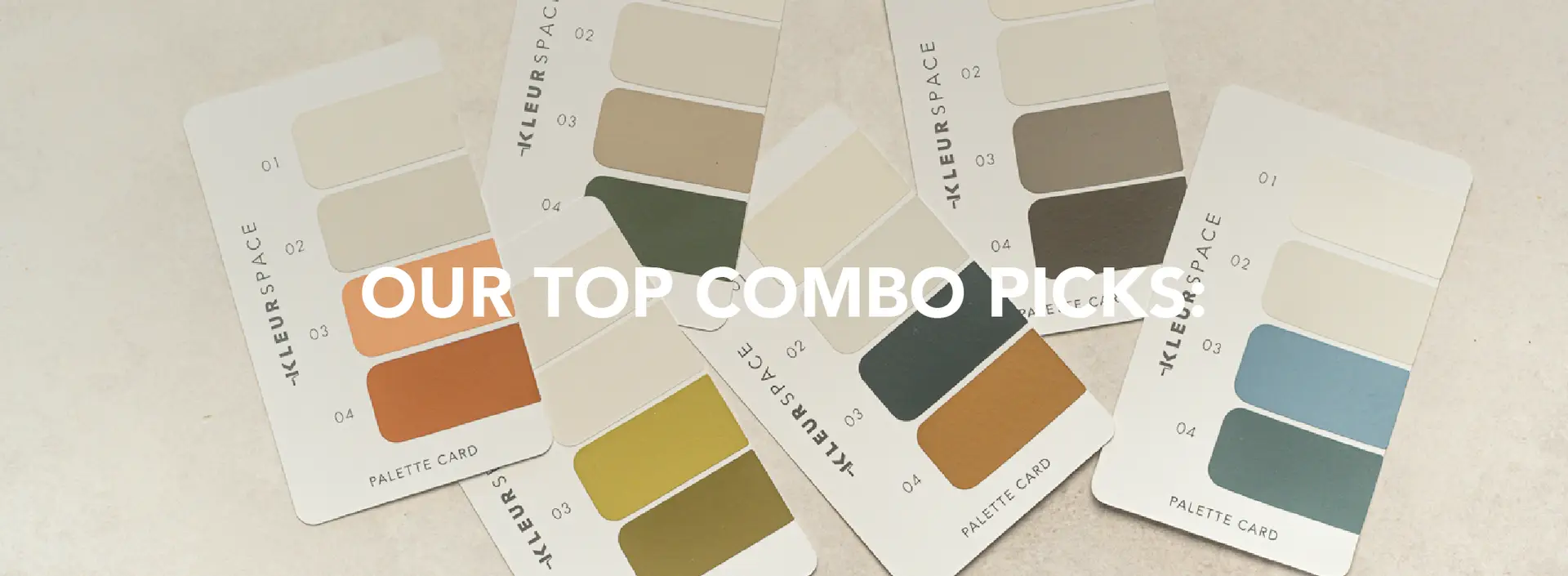
Room by Room DIY Colour Tips to Transform Your Space
For a Beach Inspired Home
Great White: Ceilings, Cornices, Doors and Trims.
Whitewater: For the majority of all walls.
Slow Down: Living Room Feature
Blue For You: Bathroom and or Bedroom Feature
For the Forest Inspired Home
Quiet White: Ceilings, Cornices, Doors and Trims.
So Close: For the majority of all walls.
Jy Weet Mos: Living Room Feature
Olive Grove: Kitchen & Main Bedroom Feature
For the Minimalist Inspired Home
Lily White: Ceilings, Cornices, Doors and Trims.
Boulders Beach: For the majority of all walls.
Karoo Dawn: Living Room Feature
Mr Mo: Kitchen & Main Bedroom Feature

Pro Tips for Choosing the Right White
1. Test Before You Commit
Paint samples directly onto your wall, and not just one! Do at least three shades of white in different corners of the room. OR if you think you’re sold hook like and sinker on a colour, paint samples of this colour in a few spots in your space, the one spot with all the sunlight, no sunlight at all and see if you’re still in love. Look at them in morning, midday and evening light – we’re a broken record about this, we know!
2. Consider the Finish
Whites can look different depending on the finish. Matte finishes give a soft, chalky look. Our poly acrylic adds a little reflection, making rooms feel more open.
3. Match with Your Décor
Your flooring, furniture, and even fabric tones play a role. A cool white next to warm wood can look harsh. A warm white in a sleek black-and-white kitchen can feel muddled.
4. Avoid the Clinical Look
Unless you’re going for hospital-chic, pure brilliant white can feel sterile. Whites with a touch of depth, like Quiet White or Boulders Beach, bring personality without overwhelming.
Want to See our Whites IRL?

Top Picks from the Sandy Beach Collection

So, All In All,
Choosing the right white takes a bit of planning, a lot of samples, and maybe a few cups of tea (or wine, no judgment here). But when you get it right, white paint can do magic: it opens up a room, complements your décor, and sets the mood.
And don’t worry, you don’t have to go it alone. You can either play around on Kleur View our colour visualised to check out how these colours and colour combos can look, OR our team at Kleur Space is ready to help you decode undertones, read the light, and find your perfect white from our Kleur Collection.
Because life’s too short for the wrong shade of white.
Your first project just got better! Join the Kleur family and enjoy 10% off your first purchase.