
So, you’ve decided to paint. Great! Choosing a paint colour should be fun, right? But somehow, it turns into an existential crisis. One minute, you’re picturing a Pinterest-perfect home; the next, you’re staring at 47 variations of beige and wondering how your life got here. (Side note, we’ve already sorted that out for you, the Kleur Collection has all the colours you need and none that you don’t, there’s not 47 variations of beige around here, anyway, we digress!) But fear not, we’ve got you! Here’s the insider scoop on how to choose the perfect paint colour, Kleur-style.
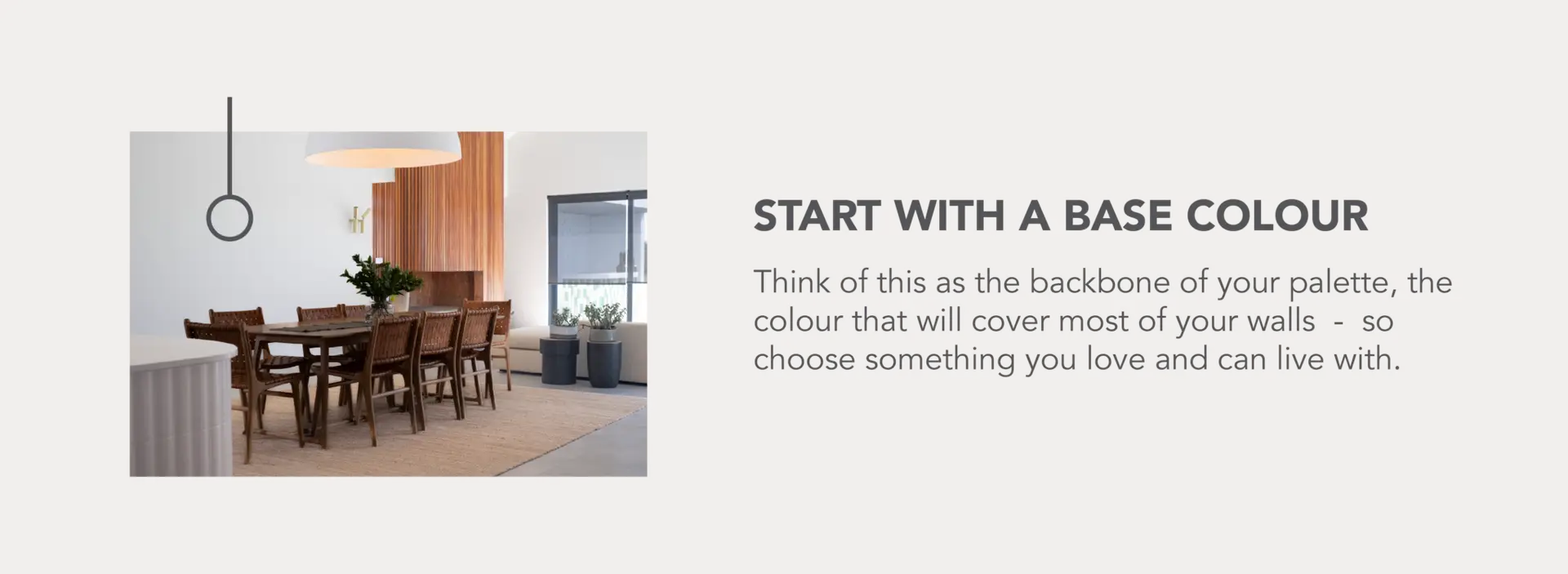
How to Pick an Base Colour.
Start with a Base Colour
Think of this as the backbone of your palette, the colour that will cover most of your walls and inform the colours of your big furniture pieces. Your base colour sets the tone for the whole space, so choose something you love and can live with.
For a calm, airy feel: Go for soft neutrals like warm whites, greys, or earthy beiges, anything in our Sandy Beach Collection will be your colour, but if you want us to just tell you the answer and be done with reading this blog post, our best sellers are Great White, Weskus, and So Close. (Alright, some of you are tapping out – farewell! For the rest who still want to be in class… yes, you may go to the bathroom. Now, let’s carry on!)
For a bold, moody vibe: Are you a person who believes more is more, side note: please can we be friends? Colour drenching is all the rage right now, so going with bold colours all through out your space can be the dopamine hit you didn’t know you needed. Wanna know our colour choices? For greens, say hello to Mary-Jane for a rich, earthy vibe, or if you’re after something softer but still packs a punch, our star colour Pistachio is the way to go.
Feeling bold in blue? Navy tones like Pottie’s are always a winner, but if you’re after something more chilled, Blue Monday is exactly what it promises, your ultimate serene escape.
Or maybe grey is calling your name? Storming in would be our best selling Stormtrooper, its sophisticated, moody, with just a subtle amount of drama (so no need for a drama detox a few months down the line).
For warmth and cosiness: Earthy tones like terracotta, rich browns, or mustardy yellows work beautifully, our African Sunsets collection is a winner for adding warmth and cosiness.
Pro Tip: If you’re completely lost, look at colours that already exist in your space, like your floors, kitchen cupboards, or even your favourite furniture piece.
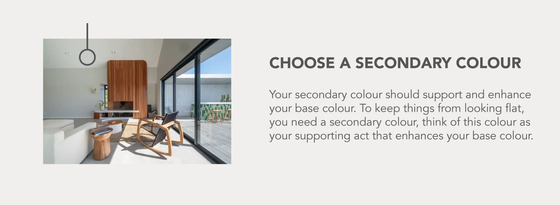
How to Pick an Secondary Colour.
Choose a Secondary Colour
Your secondary colour should support and enhance your base colour. Think of your colour palette like a well-dressed outfit, it works best in layers! Your base colour is your foundation, the main layer in your space (usually on walls or large furniture pieces). But to keep things from looking flat, you need a secondary colour, think of this colour as your supporting act that enhances your base colour. This is often the second most used colour in your space. A secondary colour could be:
A secondary colour could look like, 1 or 2 shades lighter or darker in the version of your base colour to add depth. Cheatsheet incoming: If you’re going with Weskus, it’s supporting act can be Gently Worn or Driftwood – if you’re feeling you need colourful support, Chickpea or Volan work wonders!
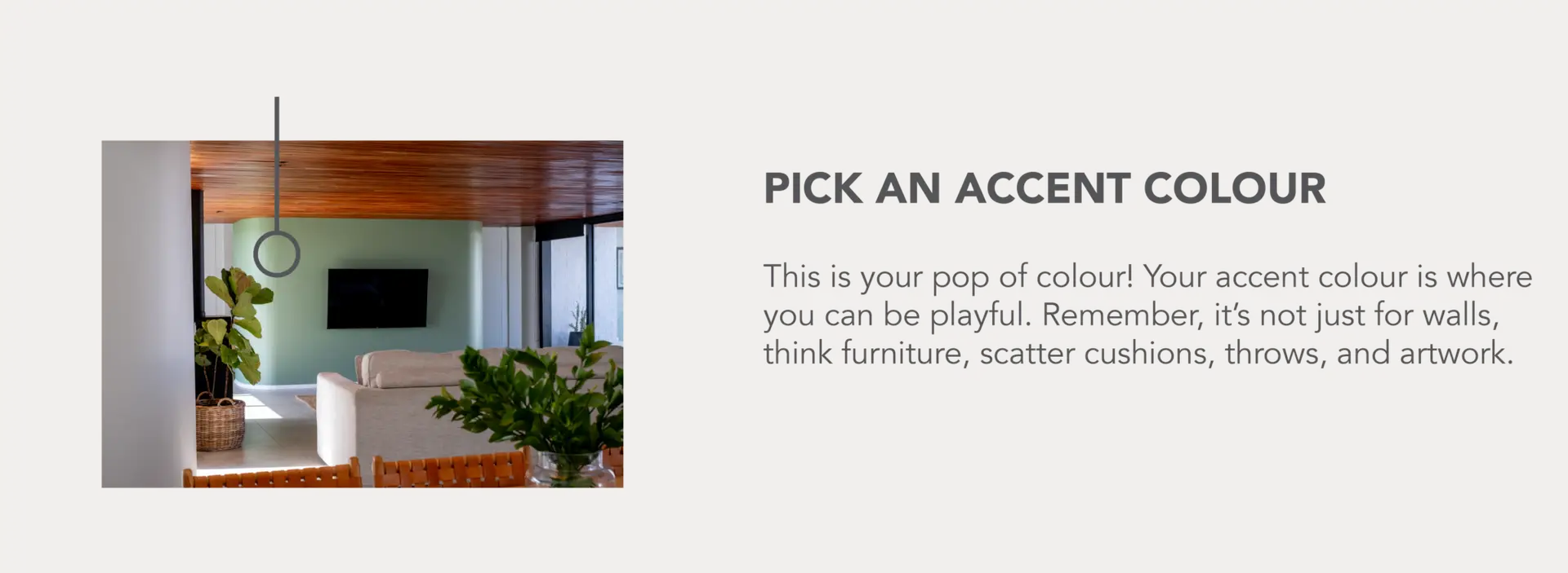
How to Pick an Accent Colour.
Pick an Accent Colour (This is Where the Magic Happens!)
This is your pop of colour (if you’re a designer, we’re sorry we used such a triggering phrase)! Your accent colour is where you can be playful. Remember, it’s not just for walls, think furniture, scatter cushions, throws, and artwork. Take our colour cards along when you shop to ensure everything ties together beautifully. You can also paint a side table in an accent colour if you want low impact drama. Need help? In this blog, we’ll show you exactly how to paint furniture like a pro.
If your main colours are neutral, go bold with your accent (e.g., emerald green such as Seaweed cushions in a beige room).
If your base and secondary colours are bold, keep your accents neutral to avoid overpowering the space.
Don’t be afraid of unexpected combinations, like an ochre, such as Goldilocks with a soft blue such as Cloud 9, or deep plum colour like Sea Urchin with sage green like Misty Mountain!
If you’re looking for some inspiration – worry no more, we’ve got your covered (don’t we always)! We have a killer Pinterest Board with dreamy and bold spaces for you to steal ideas from.
Foolproof Colour Combinations That Always Work
Choosing a colour palette isn’t about randomly picking a shade and hoping for the best. It’s about creating balance and harmony in your space. If you’re still staring at paint swatches like they’re a foreign language, here are some go-to combinations that designers swear by:

Colour Theory: Monochromatic: Different shades of the same colour (e.g., navy, sky blue, soft baby blue). Elegant, calming, and super easy to get right.
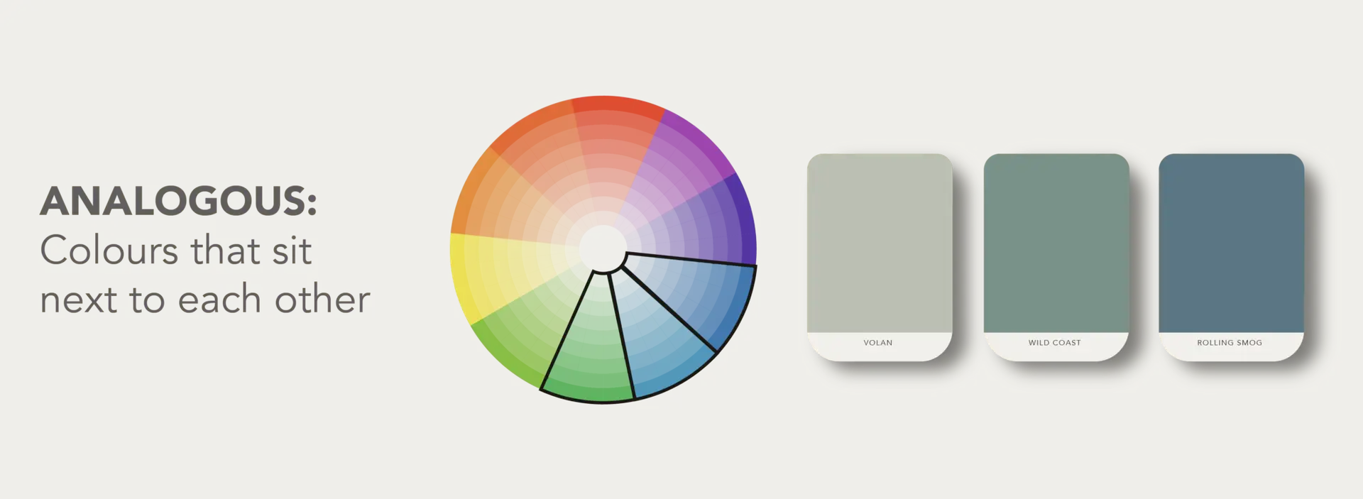
Colour Theory: Analogous: Colours that sit next to each other on the wheel (e.g., blues and greens for an ocean-inspired vibe, or pinks and reds for warmth). This creates a harmonious, natural feel.
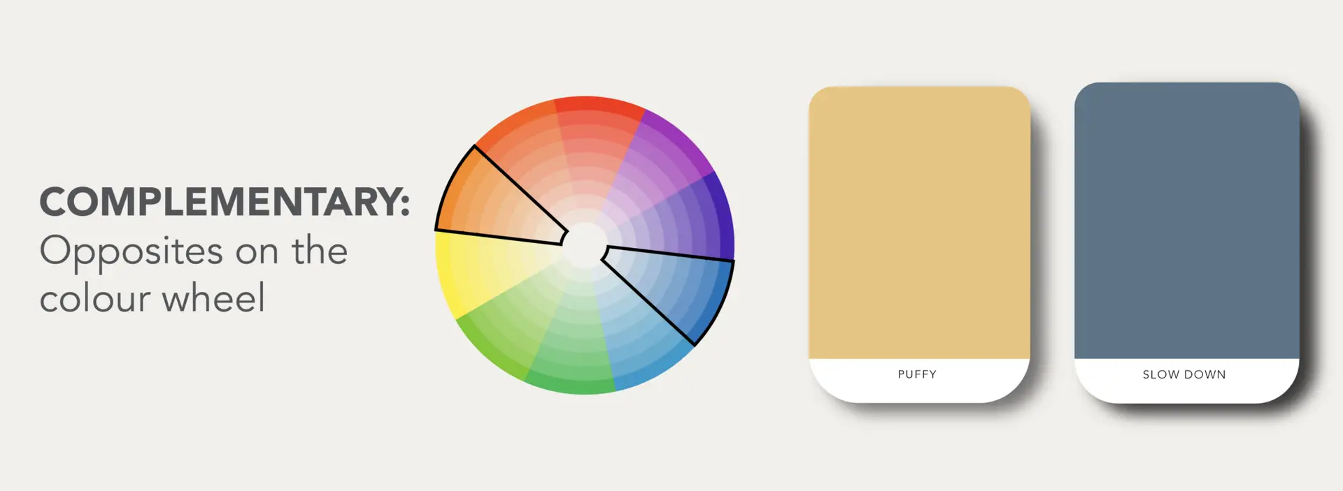
Colour Theory: Complementary: Opposites on the colour wheel (e.g., blue & orange, green & red). High contrast, full of energy, and perfect if you love a bit of drama!
Before you commit to an entire wall, test out your options in different lighting – which brings us to our next point…
The Secret Ingredient – Light!
Although this isn’t a colour combination, it sorta is, because the way light plays with colour is a whole other combo in itself. Now we know, we’ve mentioned this before, but we’ll bang on about this for awhile, to remind you that, that Pinterest Pic you saved ain’t gonna look so great in your South Facing Room. Here’s the quick lowdown:
South-Facing Rooms: Cooler, darker spaces, warm it up with cosy, earthy tones. Think rich terracotta, warm greys, or deep greens.
North-Facing Rooms: Sunlit glow all day, anything goes!
East-Facing Rooms: Bright mornings, shadowy afternoons, warmer tones help keep things balanced.
West-Facing Rooms: Golden afternoons, warm neutrals and soft whites will complement the light beautifully.
Need more info on this, and what colours suit each direction? Read more in this blog post.
Let Nature Be Your Guide
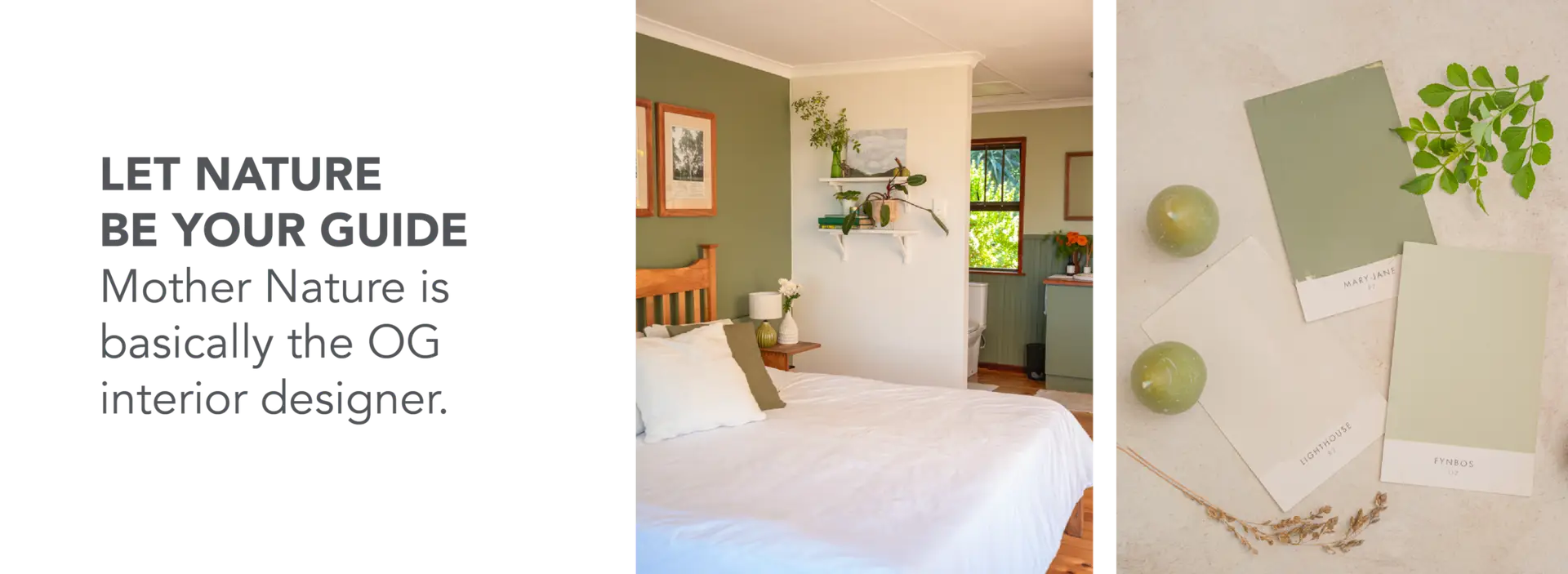
Mother Nature is basically the OG interior designer, think about a sunset, the beach, or a forest. The colours always work together. When in doubt, step outside. Nature has been effortlessly putting together colour palettes since the dawn of time – no colour wheel needed! Look at the ocean meeting the sand, the deep greens of a forest, or the fiery hues of a Karoo sunset.
The trick? Identify what feels right and translate that into your space. Love a stormy Cape coastline? Think deep blues and moody greys. Obsessed with a Free State field in winter? Warm neutrals and soft greens might be your guy. If Mother Nature approves, so do we.
How to use it: Love the ocean? Think deep blues, soft sandy tones, and crisp whites. Obsessed with the bushveld? Go for earthy greens, rich browns, and warm neutrals.
Pro tip: If Mother Nature can make these colours work, so can you!

The Artwork Approach
If picking a colour palette feels like a trick question, cheat a little. Use an artwork you love as a guide! Think about it: artists are basically colour geniuses, and they’ve already done the hard work of putting together stunning combos.
Take, for example, a painting of rolling hills and sky. You could pull the rich blues for the walls, the soft earthy tones for the furniture, and the crisp whites for trims. The key is to break the artwork down into dominant, secondary, and accent colours, then apply that to your space. Easy, right?
How to use it: Pick 2-3 main colours from the artwork. Use the boldest one for accents (like cushions or a statement wall) and the softer shades for bigger areas (like walls or furniture).
Now, if you’re still feeling insecure on what colour to go with, we have some handy tips below:
The Ultimate Cheat Sheet for the Colour-Challenged
Here’s what our experts always consider when selecting colours:
Mood: What vibe are you going for? Calm and serene, go with neutrals from Sandy Beach Collection. Moody and dramatic, go with darker tones like, Bottlenose, or Rooibos. Your colour choice sets the tone.
Location: Beach house, easy any colour in Ocean Swell Collection. City loft, A mix of colours from the Sandy Beach Collection and the Rain Clouds Collection. Bushveld retreat, yup, you guessed it any colour from our Kloof or Veld Collection. Your surroundings should influence and inform your palette.
Style: Modern style, often colours from the Rain Clouds Collection go well. Is your style classic, then Sandy Beach Collection might just have your winning colour. Or are you a boho lover, colours from either our Forest Walk Collection or Burst of Berries Collection will have your dream colour match.
Orientation: As we mentioned, lighting is everything! Always consider how natural light will play with your chosen colour.
Then, we have some other tips we often mention to clients when coming up with a personalised colour palettes:
Look at your wardrobe: If you always wear neutrals with a pop of red, that’s probably a palette you’ll love in your home.
Steal from nature: Think earthy greens, ocean blues, or sunset-inspired pinks and golds.
Use a design anchor: An artwork, rug, or even your favourite couch can inspire your whole palette.
Keep it simple:Three colours (base, secondary, and accent) are all you need for a cohesive look.
Now, we hope we’ve inspired you with enough confidence to choose not only a banger colour palette for your space, but for all your mates homes. At Kleur Space, it’s our passion to make choosing a paint colour an exciting part of making your home feel like you. And remember – a tin of paint is a lot cheaper than therapy, so if you’re going through a big life change, maybe it’s time to repaint your walls and move on!
And if all else fails, call us. We’re basically paint therapists at this point.
Your first project just got better! Join the Kleur family and enjoy 10% off your first purchase.