
Home is where the heart is, but sometimes it can feel more like home is where the to-do list lives. If your space isn’t sparking joy, don’t panic and start Googling “how to sell a house fast.” Often, the secret to falling in love with your space is as simple as a fresh coat of paint. A splash of the right colour can transform your house into the home you deserve. Let’s talk about how to make it happen.
Rediscovering the Joy in Your Home
Sometimes, falling in love with your space isn’t just about aesthetics; it’s about reimagining how you use it. Paint can inspire you to rearrange furniture, bring in new decor, or appreciate the space you’ve already created. It’s a small change that can have a big impact, helping you to see your home with fresh eyes.
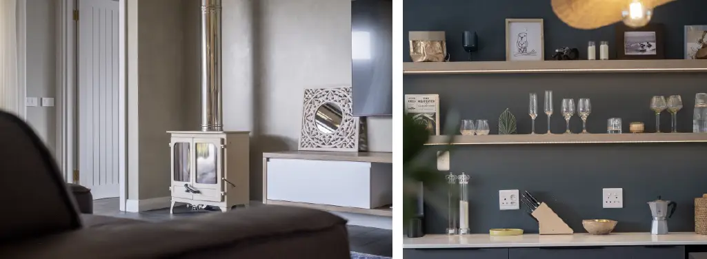
Our number one DIY tip to falling in love with your space: Rediscovering the Joy in Your Home
The Power of Paint
Think of paint as the final touch that pulls everything together, like All Gold Tomato Sauce on your hot dog. You’ve got the furniture, the decor, and the family photos, but it’s the walls that hold it all together. The right colour doesn’t just decorate; it elevates, making your space feel cohesive, intentional, and uniquely yours.
Paint can also evoke emotions and set the tone for your daily life. From creating a calm retreat to a lively, energised feel, the right colour palette can turn your house into a home that reflects your personality and lifestyle.
But don’t just slap any colour on the wall and hope for the best, choosing the right colour requires a little thought. This is where we come in, think of us like your friendly neighbourhood paint fairy godparents. Here we’re going to spill the beans on our hot tips to fall in love with your space – and easily. We’re going to take all the heavy lifting out of what colours to choose for where. So buckle up, get your note pad and let’s go through our foolproof method for falling in love with your space – it all starts with choosing the right colour!

A game-changing DIY tip often overlooked: always consider the natural lighting in your space, it’s the secret to making your walls truly shine!
Consider Your Light (and Your Compass)
Natural light plays a huge role in how colours appear in your home. The orientation of your rooms can dramatically affect the way paint looks on your walls, it is a game-changer when it comes to paint. North-facing rooms are your golden children, they’re flooded with warm, natural light, making colours appear richer and warmer. Meanwhile, south-facing rooms are the drama queens, often cooler and darker, which can make colours look a bit washed out.
South-Facing Rooms:
These spaces tend to be cooler and receive less direct sunlight. To counteract this, choose warmer tones like GUST, a darker but soft warm beige or 40 WINKS, a gentle and soft warm light pink that adds a cosy touch. OR if you’re feeling a little dramatic, opt for something with a bit more depth. A colour like CROCODILE FERN, a to die for green. It’ll add character and keep the space feeling dramatic without becoming too chilly.
North-Facing Rooms:
Bathed in sunlight, these rooms can handle both warm and cool tones. JOCK, a deeper sandy light taupe, is a great choice for adding depth while complementing the sunlit glow. It’s the paint equivalent of a big hug. North-facing rooms can handle darker tone colours well, so if you’re a fan of deep rich colours, these rooms are your safe bet, rich colours like KEEPER, or HARKERVILLE do very well in North-facing rooms.
East-Facing Rooms:
The morning light in these spaces is crisp and bright. Enhance this natural energy with a colour like a warm colour such as THE LINKS, which will shine beautifully in the morning. VINTAGE HILUX is another colour that shows off in an east-facing room, for a moody look, HARKERVILLE.
West-Facing Rooms:
These rooms benefit from warm afternoon light. Pair this golden glow with WESKUS for a timeless, airy look or a warm green like PISTACHIO make west-facing rooms *a chef’s kiss*.
By choosing colours that work well with the orientation of your home or room, you’re guaranteed that you won’t be left with sweaty hands and regret etched on your face once you’ve finished painting. Be mindful of how the natural light affects the room you’re painting, and make your colour decision based on that, this way you’ll emoji heart eyes the room every time you walk into it.

Room by Room DIY Colour Tips to Transform Your Space
DIY Room by Room Recommendations
A home that works for you is a home you’ll love. Divide your space into functional zones to maximise its potential. Use colour to separate areas for work, relaxation, or play. Each room in your home has its feel (or at least it should). Colour has the unique ability to set the mood of a space, create illusions of size, and even affect how you feel. Choosing the right paint colour can be daunting, but it’s also incredibly rewarding. When you get it right, the transformation can feel almost magical.
Here’s how to match the right colour to the right space:
The Lounge
The lounge is where you relax, entertain, and binge-watch your favourite series. A versatile shade like SO CLOSE, an off-white, works wonders here. It’s warm enough to feel homely but neutral enough to let your furniture and decor shine. We love pairing a darker neutral tone with this colour to add depth, CHAI is our go-to.
The Bedroom
Soft and soothing is the name of the game. Enter DRIFTWOOD, a gentle warm beige that’s perfect for creating a dreamy, restful retreat. Pair it with neutral bedding and natural textures, and you’ve got yourself a slice of paradise. If you want a feature wall in your bedroom, for a va-va-voom drama feature wall, we’re loving SEAWEED a deep green that reminds us of a dramatic stormy ocean, if you want a lighter colour feature wall, we have so many options for you, it’s hard to list them (feels like we’re having to say who our favourite child is). For those who love green, FYNBOS and CHICKPEA are winners! For those who find the faded ocean is their solace, GREY HERON and SLOW DOWN are perfect colours.
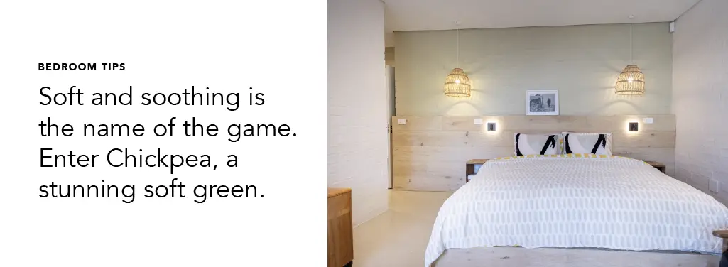
DIY Colour Picks for Your Bedroom
The Kitchen
Kitchens are a fun one – they either fall into a timeless design, opting for warm neutrals or if you love that look, every colour in our Sandy Beach colour collection will be a winner. Or if you’re a trendsetter, 2025 colour trends for kitchens are, bold reds, think GLÜHWEIN. Greens, to which we find FYNBOS is the heartbeat, this light, misty green feels fresh and lively. Just what you need to inspire culinary genius (or at least make cooking dinner feel less like a chore). Blue is also taking its turn in the kitchen, WILLOW is the perfect choice for a dramatic kitchen look.
The Kids’ Room
For a pop of personality, look no further than RETRO BLUE. This vibrant yet soft blue brings energy to the room without being overwhelming. It’s perfect for sparking creativity. Another colour we love seeing in kids’ rooms is MR HAPPY and for a girl’s room, WICKS.
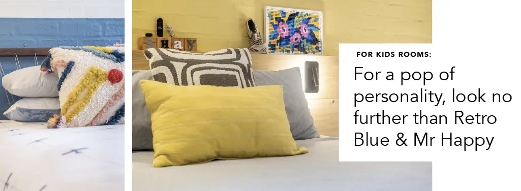
The perfect kids room colour combo DIY hack.
Home Offices
Promote focus and creativity with ROLLING SMOG, an off-blue grey with a hint of warmth that’s both sophisticated and grounding, making you hit those deadlines like it’s an A+ game of whack-o-mole.
Bathrooms
Create a spa-like retreat with CACTUS, a misty green that brings a touch of nature indoors. Or go with light and warm colours to make the bathroom feel open and airy, like LILY WHITE.
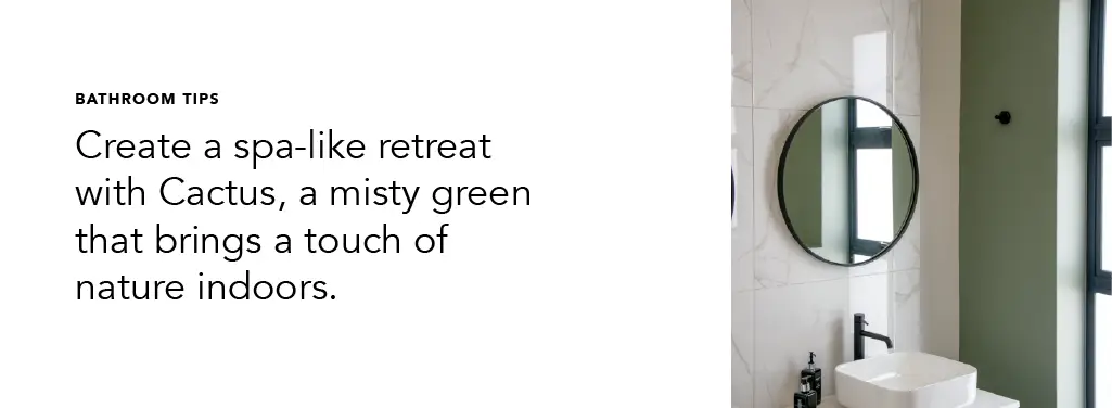
Passages and Small Spaces
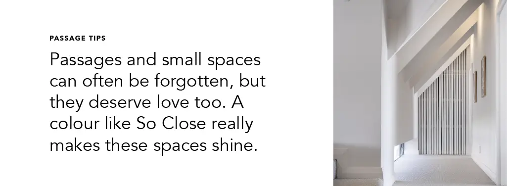
Passages and small spaces can often be forgotten, but they deserve love too. QUIET WHITE & SO CLOSE shine here, creating a light and airy feel that opens up even the narrowest of passages. Bonus: it pairs well with just about any accent colour. Or if you’re wanting that cocooned warm and cosy feel, why not go with some dark and moody colours? Say hello to our deep and embracing colours, SEA URCHIN and SEA WEED, they’re the perfect colours for a passage with a bit of drama. Pro tip, to create interest and brighten the space up, use artwork to make the space feel more dynamic and light – not a just a dark passage (of time).
When picking the colour per room, think of the purpose of the room, and the orientation add those two up along with your personal colour crushes and my friend, we’re pretty sure you’ll be hosting dinner parties in your bathroom you’ll be so proud as punch of your home and how it looks.
Tips for Choosing the Perfect Colour
Still not sure where to start? Here are a few tips:
Think About Flow: Consider how your chosen colours will flow from room to room. You want harmony, not a house that feels like a patchwork quilt.
Falling in love with your home doesn’t have to mean big renovations or expensive overhauls. Sometimes, all it takes is the perfect paint colour to make your space feel brand new, and the right paint can truly make all the difference.
So grab your rollers, put on some lekker tunes, and get ready to transform your space. Who knows? You might even start loving the idea of staying in more than going out. Here’s to a home that feels as good as it looks!
Your first project just got better! Join the Kleur family and enjoy 10% off your first purchase.