
KLEUR 2027: WHERE COLOUR IS GOING
COLOUR DOESN’T REALLY START WITH COLOUR.
It starts with what’s happening around us, the world, the economy, technology, fashion, the way we are living and even how overwhelmed we are all feeling has a huge effect on what we want from our homes.
And right now, there is a lot going on, everything is faster, everything is more polished, AI makes perfection abundant. We are constantly connected, constantly consuming, constantly being shown what our homes, clothes and lives could look like.
And at the same time, we seem to be craving almost the exact opposite; things that feel real, things that have been made by hand. Homes that feel lived in, colour that reminds us of something. For us, colour feels like a bit of an antidote to all of that.
For our 2027 forecast, we looked at what is happening globally across colour, interiors, fashion, design and culture. We looked at the bigger shifts happening in the world and then layered over something we think is just as important: how we are actually feeling.

The Colours
The past gets interesting.
This one is an ode to nostalgia. Again, when the world around us feels this fast and this perfect, there is something very comforting about looking backwards.
Not necessarily because everything was better then, but because it felt slower. Think of your granny’s kitchen, the plate she always served lunch on, the faded tablecloth, that strange cupboard colour you probably wouldn’t have chosen yourself, but somehow remember perfectly.
That is Old School; faded blues, buttery yellows, worn greens, clay pinks and warm browns. Colours that have a familiarity to them, even if you can’t quite put your finger on why. It’s more about taking that feeling of slowness and true connection that the old days had and bringing a little bit of it back.

The Colours
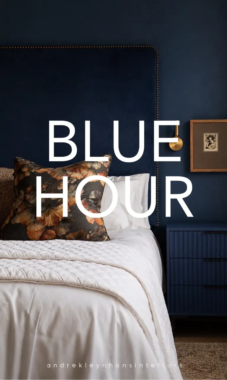
BLUE HOUR
Blue behaves like a neutral.
Blue was the one that surprised us, we knew it was coming. But we didn’t realise quite how prolific the rise would be.
And it isn’t just one blue, it’s watery blues, powder blues, old-school blues, denim, smoky blue-grey and then, every now and again, something wonderfully electric.
What makes blue particularly interesting right now is that it sits right at the intersection of two huge influences: nature and technology.
It reminds us of water, sky and cool air, but also screens, digital worlds and that very clear electric blue that technology has made part of our everyday visual language.
Somehow it manages to feel both familiar and new. And importantly, blue is incredibly calming. We think we’re going to see it used less as “the blue room” and more in the way we have used green or beige before, almost as a neutral.
The Colours
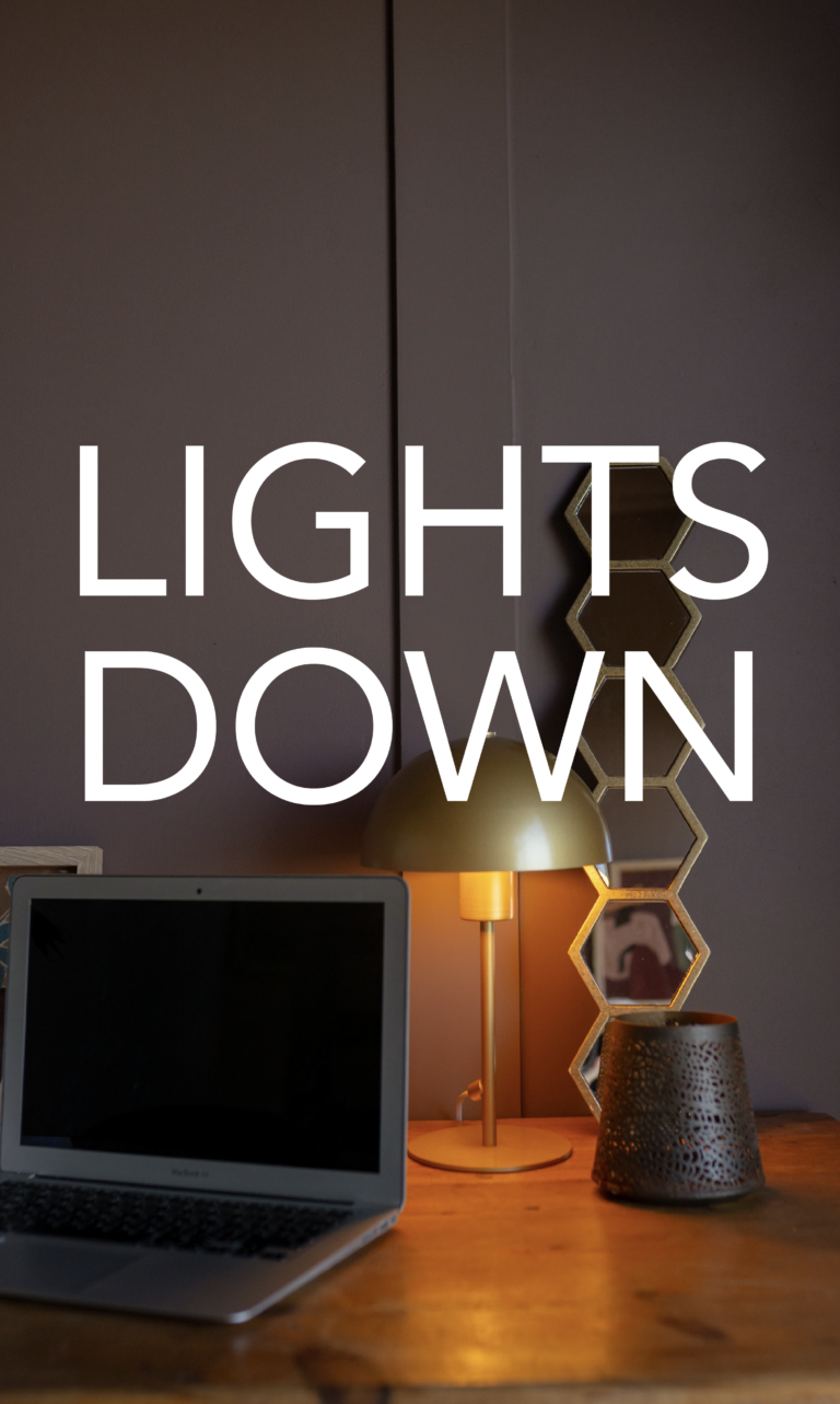
LIGHTS DOWN
Dark colour becomes comfort.
If there is one thread running through almost everything we've spoken about for 2027, it's that we're overwhelmed. The world is loud and fast, we're always online, always reachable and, quite frankly, it sometimes feels impossible to properly switch off.
LIGHTS DOWN is a rebellion against that. Dark, rich colours carried across walls and ceilings, creating that wonderful cocooning feeling where everything outside seems to go a little quieter.
Think of a bedroom you can't wait to retreat to, or a dining room where the conversation carries on long after dinner is finished.
It's not about making a room dark for the sake of it. It's about creating a home that feels like somewhere you can finally switch off from the world outside.
The Colours
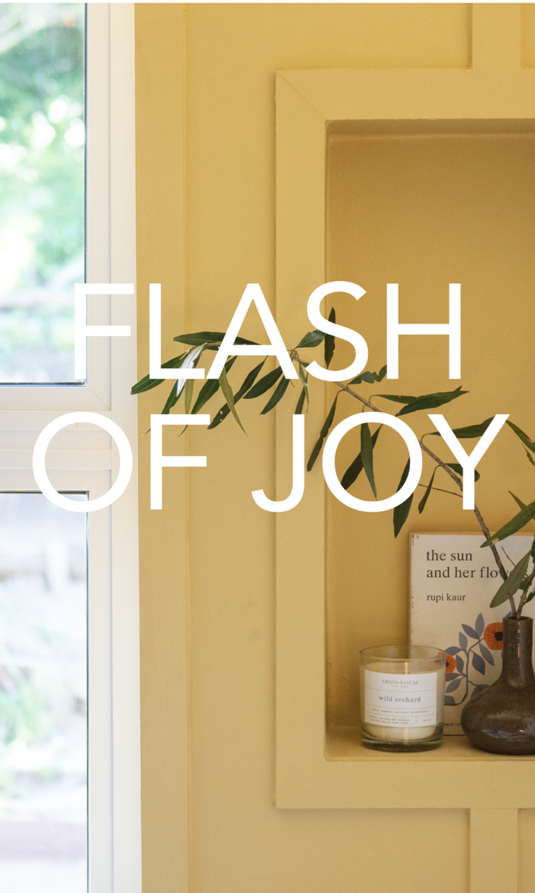
AND THEN THERE’S
A FLASH OF JOY
This one is exactly what it sounds like.
Joy. Because although we are craving calm, grounding and nostalgia, the desire for colour is very, very real. We are seeing brighter colour coming through everywhere, but that doesn’t necessarily mean everyone is about to paint an entire room cobalt blue.
Think of it as punctuation for a room. A little exclamation mark of colour that makes everything else more interesting.
A yellow door, a blue cabinet, a pink table, something a bit bright and unexpected. Use it on a whole wall if you want to, or just paint the bedside table, that’s sort of the point, anything to bring in a flash of joy. And remember, it's only paint. If you don't love it, you can always paint over it.
The Colours
We pulled this report together using international colour forecasting, paint forecasts, fashion, interiors, design events, cultural shifts and what is happening in the world more broadly.
But then we filtered all of that through Kleur. Our own colours, the homes we see, what people are buying, what we are hearing in store.
But perhaps the most important part of this report is this: have some fun with it Paint is one of the easiest ways to experiment in your home. It doesn’t have to be a forever decision, try the colour you keep talking yourself out of, paint the door pink, do the blue cupboard. Pick something from A Flash of Joy that you would normally never choose and see how it makes you feel. You might love it, you might not, and that is the beauty of paint. You can live with it, change your mind, paint over it and try something completely different. It gives you room to play with trends, push your own taste a little and figure out what actually feels like you.
The Kleur 2027 Colour Forecast was compiled together with the Kleur team.
COLOUR IS OUR THING.
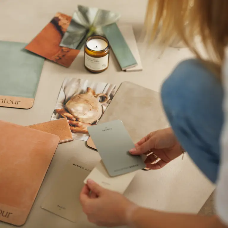
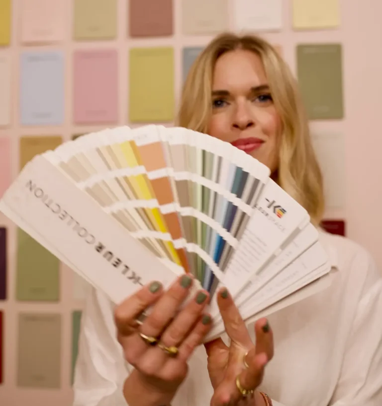
Colour is so tied up in memory, personality and how we feel. The phrase ‘beauty is in the eye of the beholder’ really does apply here. What I loved about putting this forecast together was realising that underneath all the data and all the trend reports, the same human things kept coming through. We want our homes to ground us, we want comfort, we want nostalgia, we want escape. And, thankfully, we still want a bit of fun.
These collections aren’t us telling you what colour your house needs to be in 2027. They’re our take on where colour is moving, why we think it is moving there, and hopefully a bit of inspiration to do something with it that feels like you.
Because trends will come and go, but living in a colour you actually love is far more interesting.”
WILLOW TUCKER